A catalogue of the best layperson-friendly framings ever devised for technical lighting concepts — assembled for bshsg.com so that a Singapore HDB homeowner can grasp lux, Kelvin, beam angle, glare, CRI, and isolux contours in five seconds rather than five paragraphs.
Prepared for: Steven Choo / Ban Soon Heng Engineering · Audience: Singapore HDB/condo homeowner mid-renovation · Use: Source material for product page infographics, fixture cards, and educational pop-ups on bshsg.com
1. Lux, lumens & brightness
The single most-confused pair of numbers on any lighting product page. The fix is almost always the same: replace the units with a water metaphor and a ladder of everyday scenes.
What the homeowner actually wants to know: "Will this light be bright enough for my kitchen?" — not "what is the SI unit of illuminance?"
Built-in: an everyday lux ladder
0.3 lxMoonlightBright full moon, clear night, you can just make out a path
10 lxTwilightSunset / sunrise on a clear day, ambient only
100 lxHallwayHDB corridor at night — enough to walk, not enough to read
150 lxLiving roomCosy evening, sofa, TV on. Above this it stops feeling "cosy"
300 lxBedroom (task)Reading on the bed without eye strain
500 lxKitchen worktopChopping onions safely — SS 531 minimum for food prep
750 lxVanity / StudyMake-up mirror, fine homework, sewing
1 000 lxOvercast dayOutside, no direct sun
10 000 lxBright shadeOutdoors under an HDB void deck at noon
100 000 lxNoon sunDirect Singapore midday sun
Source synthesis: Wikipedia "Orders of magnitude (illuminance)", IES residential recommendations, SS 531:2018 task-level illuminance.
Reolink — featured diagram, lux vs lumens explainer
The water-faucet analogy
Source: Waveform Lighting, Reolink, ETAP — repeated across the entire consumer-lighting web
"Lumens tell you how many drops leave the faucet every second. Lux tells you how many drops land on one square metre of ground."
Why it works: it converts an abstract SI ratio into a sensation everyone has felt at a kitchen tap. It also makes "distance from the bulb" intuitive — turn the faucet further from the floor and fewer drops hit each tile, even though the faucet isn't pouring less water.
★★★★★
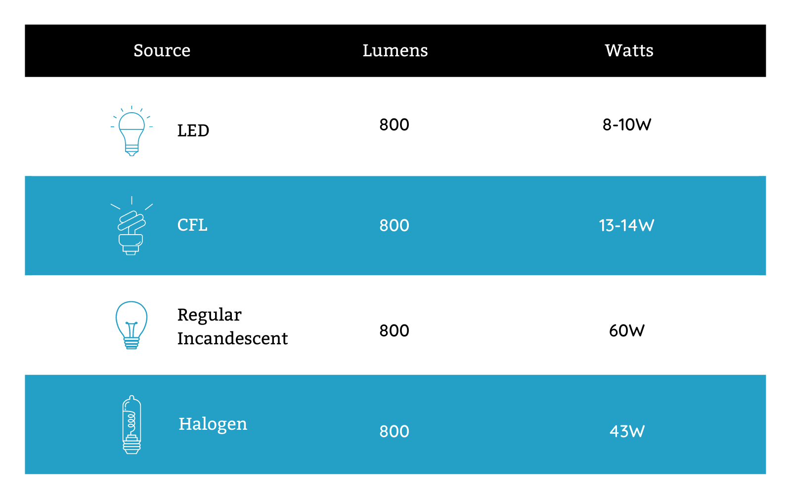
Alcon Lighting — lumen-to-watt conversion graphic
The 40 / 60 / 100 watt-equivalent ladder
Source: VOLT Lighting, LEDVANCE, Alcon Lighting, US Energy Star labelling
"40 W = ~450 lm · 60 W = ~800 lm · 75 W = ~1 100 lm · 100 W = ~1 600 lm"
Why it works: a generation of buyers learned brightness in watts. The ladder lets them keep that mental model while quietly switching the unit underneath. This is the most successful translation pattern in mass-market LED packaging — every Philips, GE, Feit and IKEA box still leads with the watt-equivalent.
★★★★★
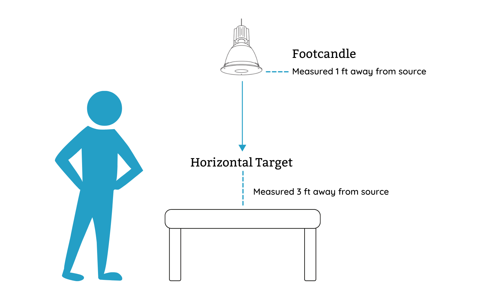
Alcon Lighting — foot-candle / lumens per sqft illustration
"Lumens per square metre" rules of thumb
Source: IES residential lighting handbook, Super Bright LEDs, Home Depot guide
Why it works: it lets a homeowner do their own back-of-envelope sum: room area × lumens/m² ÷ fixtures = lumens per fixture. Three numbers, no DIALux. Great fit for bshsg.com — every product card could show "covers ~__ m² at task level".
"Enter room width, length, ceiling height, room type. Get total lumens recommended, then divide by fixture lumens."
Why it works: moves the maths off the buyer and onto a form. The homeowner just needs to read a tape measure. This is the lightest-touch version of a DIALux simulation — give it to a consumer free, capture leads.
★★★★
Feit Electric — soft white tonal example
Reolink & security-camera framing: "What can you actually see?"
Source: Reolink, security-camera buyers' guides
"At 1 lux you can read a newspaper held in front of you. At 10 lux you can recognise a face across a corridor. At 100 lux you can read a menu in a restaurant."
Why it works: reframes lux as "what tasks can I do?" rather than as a physics unit. Brilliant for bshsg.com product cards: instead of "350 lx at 2.4 m", say "enough light to read a menu under this downlight at sofa height."
★★★★★
Wikipedia — vertical lighting scale (used here as a visual proxy for the lux ladder)
The "moonlight → noon sun" log ladder
Source: Wikipedia "Orders of magnitude (illuminance)", Hella isolux, This Old House
"0.3 lx full moon → 10 lx twilight → 500 lx kitchen worktop → 100 000 lx noon sun. The kitchen is 1 666× brighter than the moon, the sun is 200× brighter than the kitchen."
Why it works: a logarithmic ladder makes the head-spinning range (six orders of magnitude!) feel ordered and human. Anchors every interior number against the only two values everyone already knows — moon and noon sun.
★★★★★
2. Colour temperature (Kelvin)
Kelvin is the second-most-confused number in lighting. Every successful translation does the same thing: pair a temperature with an everyday light source, plus a colour swatch, plus a room recommendation.
What the homeowner actually wants to know: "Will my living room feel cosy or feel like a hospital?"
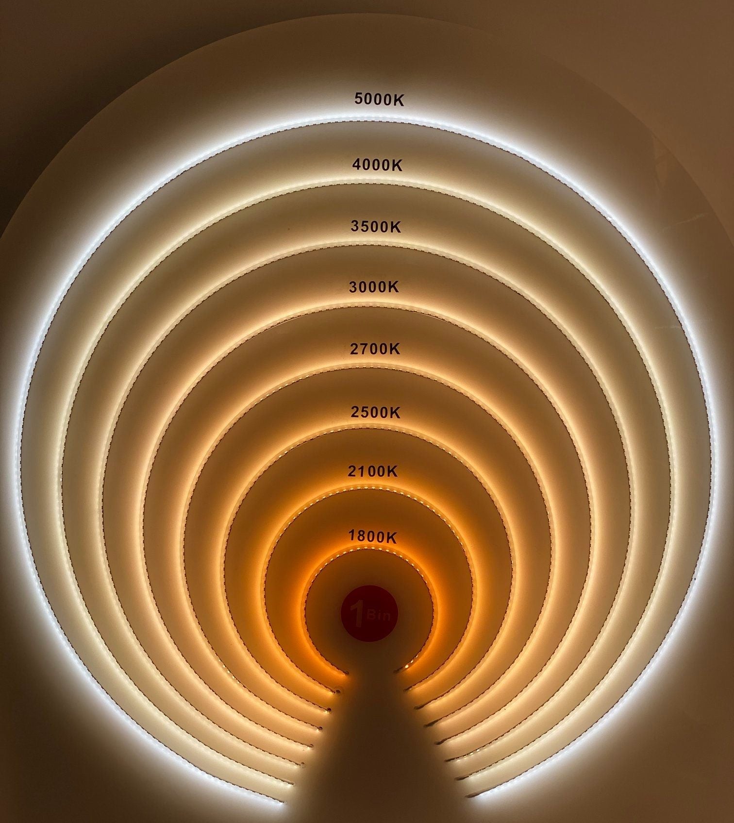
Built-in: a CCT swatch strip
1800K · candle
2700K · cosy
3000K · warm
4000K · neutral
5000K · daylight
6500K · cool
CSS-rendered swatch — colours are perceptual approximations of black-body radiation at each Kelvin value (per Wikipedia "Color temperature").
"1800 K = candle flame · 2700 K = old incandescent bulb · 4000 K = office fluorescent · 5500 K = midday sun · 10 000 K = clear blue sky"
Why it works: Kelvin is meaningless until you anchor it to physical objects that already glow at that temperature. A candle really is 1800 K and the noon sun really is 5500 K — this isn't an analogy, it's the literal definition.
★★★★★
Feit Electric — cool white tonal sample
Feit Electric / IKEA: the side-by-side same-room photograph
Source: Feit Electric blog, IKEA buying guide, Westinghouse
Five identical living-room shots, one each at 2700 K / 3000 K / 3500 K / 4000 K / 5000 K. The viewer instantly sees the room shift from "candlelit dinner" to "doctor's clinic".
Why it works: tone is an aesthetic choice, not a number. Show the choice. Five photos beat any swatch strip because the buyer is already imagining their own sofa in the picture.
★★★★★
Feit Electric — bright white
Apartment Therapy: "warm or soft white, 2 500–2 700 K, full stop"
Source: Apartment Therapy, Wirecutter, Pooky
"The warmest light bulbs should have 'warm' or 'soft white' written on the package, with a Kelvin (K) rating of between 2 500 and 2 700 degrees. Anything cooler will make your living room feel like a showroom."
Why it works: consumer media does not negotiate. They give one number and a hard rule. Engineers hate this; homeowners love it. For bshsg.com living-room products, default to 3000 K (Singapore preference) and write the rule on the page.
★★★★★
Feit Electric — daylight white
Lutron / Philips Hue: name the mood, not the Kelvin
"Relax = 2237 K · Read = 2890 K · Concentrate = 4291 K · Energize = 6410 K — but the app only ever shows the mood name."
Why it works: hides the unit behind the intent. The buyer wants to relax — they tap "Relax" and the app picks the temperature. The most aggressive consumer-facing abstraction of all, and it works because mood is what they actually wanted to buy.
A printed strip moving smoothly from orange to white to blue, with Kelvin values along the bottom and bulb-box terms ("Soft White", "Bright White", "Daylight") along the top.
Why it works: three layers of vocabulary stacked on one image: Kelvin number, marketing term, actual colour. The buyer reads whichever layer they already understand, and absorbs the other two.
"For Singapore HDB living rooms, 3000 K is the sweet spot — warmer than 4000 K (avoids the showroom look), brighter than 2700 K (avoids feeling sleepy in our climate)."
Why it works: localises a global rule. A Western blog says 2700 K; the Singapore consensus is 3000 K because tropical homes tend to want a brighter cosy than a Boston brownstone. BSH should mark every interior fixture's "Singapore default" CCT — it shows local expertise.
"Cool blue at noon → warm gold at sunset → candlelight at midnight. Your lights should follow the same arc your eyes evolved with."
Why it works: turns CCT into a story about time of day. Especially powerful for smart-bulb & tunable-white products. Tells the buyer why they need adjustable CCT — not because they want to fiddle, but because the human eye expects light to change.
★★★★
3. Beam angle
Beam angle is one concept where BSH already has an excellent translation pattern — the photometric pool diagram (beam × ceiling height → pool diameter). Below is the wider design vocabulary.
What the homeowner actually wants to know: "Will this downlight light up the whole room or just a spot the size of a dinner plate?"
Built-in: beam-cone visual ladder
24° narrow spot
Single object — vase, art
38° spot
Kitchen island / dining
60° medium flood
General downlight
120° wide flood
Ambient ceiling wash
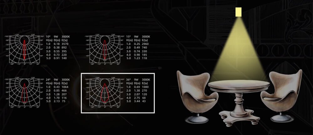
KLM Lighting — downlight beam angle illustration
The cone diagram with floor diameter
Source: KLM Lighting, BEGA, modern.place, Optics for Hire calculator
"Beam Diameter = 2 × Distance × tan(Beam Angle ÷ 2)." A 38° downlight at 2.4 m HDB ceiling height casts a pool roughly 1.65 m wide on the floor — a single dinner table.
Why it works: turns a degree number into a tangible pool diameter on the floor. This is BSH's existing pattern — keep it, and add a Singapore-default ceiling height (2.4 / 2.6 / 2.7 m) so the buyer doesn't need to know trig.
★★★★★
KLM Lighting — 10° narrow beam on a table top
Photograph of the actual pool — narrow vs wide
Source: KLM Lighting, VOLT landscape lighting, ERCO photometrics
A side-by-side photograph: same table, same fixture, 10° vs 36°. The 10° pool is a sharp circle of light on a vase. The 36° fills the whole table top.
Why it works: doesn't ask the buyer to visualise a cone — shows them the floor. Maps cleanly to use-cases: "spot a vase" vs "light a dining table" vs "fill a corridor". On bshsg.com, each spotlight SKU should show its own pool photo.
★★★★★
KLM Lighting — 36° beam over a dining setup
The "torch vs lantern" analogy
Source: VOLT landscape lighting, RC Lighting, Kings Outdoor
"A narrow beam is a torch — strong throw, small pool. A wide beam is a lantern — soft, big spread, less reach. Buying a downlight is just choosing between the two."
Why it works: two objects everyone has held. The buyer immediately understands that narrow ≠ better — it's a different tool. Pairs well with use-cases: "torch for art, lantern for general lighting".
"For HDB ceilings (2.5–2.7 m), space 60° downlights 1.0–1.2 m apart on a grid. For 38° beams, drop to 0.8 m or you'll see scallops on the wall."
Why it works: turns beam angle into a shopping-list quantity. The homeowner doesn't care what 60° means — they care how many fixtures they need to buy. A spacing calculator on bshsg.com closes the loop: enter ceiling height + room dimensions → "buy 6 of these".
★★★★★
Wikipedia — vertical temperature chart (analogous structure)
"Art / single object: 10°–24°. Kitchen island, vanity: 25°–38°. General room: 40°–60°. Garage, void deck: 90°–120°."
Why it works: the buyer's question is "which beam angle do I want?", not "what is beam angle?". Skip the explanation, give the recipe. Pair each row with a thumbnail photograph and you cover 80% of decisions.
★★★★
KLM Lighting — overview again, for "lantern" framing
BSH's own photometric pool overlay (existing pattern)
A floor-plan overlay showing the lux pool from each fixture at the chosen ceiling height — a homeowner-facing version of what DIALux already produces.
Why it works: BSH already has IES data for 1 686 CGD products. A web overlay that renders the pool for any selected fixture against a configurable ceiling height is essentially a "DIALux-lite" — and is a defensible competitive moat for bshsg.com.
★★★★★
4. Glare & UGR (Unified Glare Rating)
The hardest concept to translate because the homeowner has felt it but has no word for it. UGR is also rarely seen on consumer product pages — but every premium fixture brand (ERCO, iGuzzini) leads with it.
What the homeowner actually wants to know: "Will this fixture hurt my eyes / make me squint / cause headaches?"
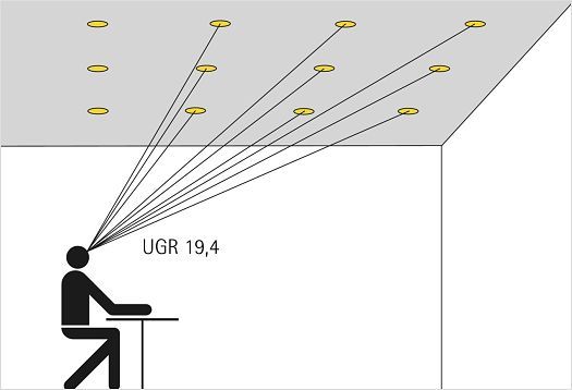
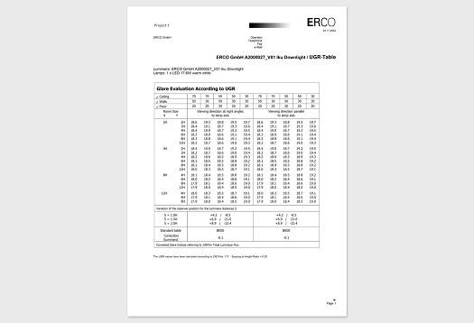
ERCO — UGR method introduction
The UGR scale: 10 → 13 → 19 → 22 → 28
Source: ERCO, CIE 117, NVCUK, Acuity Brands FAQ
"UGR 10–13: barely perceptible. 16–19: acceptable for offices & classrooms. 22+: noticeable. 28+: unbearable for most people."
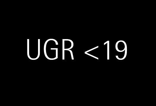
Why it works: like the Beaufort scale for wind, a banded interpretation lets a homeowner aim for "< 19" without learning the formula. Print "UGR < 19" on every bshsg.com office / study fixture — it shows that BSH knows the standard.
★★★★
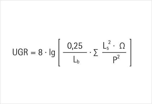
ERCO — the UGR formula (engineer's reference)
The "bare bulb vs diffused" photo pair
Source: ERCO blog, Acuity Brands, NPR LED article
A photograph of the same room twice: bare bulb hanging from the ceiling (high UGR, you squint at the picture); diffused panel or recessed downlight (low UGR, the eye relaxes).
Why it works: bypasses the unit entirely. The buyer literally feels their pupils contract looking at the bad photo. Most consumer-lighting articles rely on this technique — they never quote a UGR number, just show two pictures.
★★★★★
ERCO — "UGR < 19" badge concept
"Light the room, not the eyeball" — ERCO's tagline
Source: ERCO Lichtbericht, Lutron downlight white paper
"Good lighting illuminates surfaces. Bad lighting illuminates eyes. The simplest test: can you see the lamp from where you sit? If yes, you will eventually get a headache."
Why it works: one sentence rule, sticky. Encourages buyers to choose recessed / cove / deep-baffled fixtures over bare-bulb pendants for living spaces. Reframes "premium fixture" as "a fixture that hides the lamp".
"Excessive brightness due to inappropriate lighting reflects on whiteboards, computer screens, windows and ceilings, causing eye troubles, headaches, and often disrupting workflow."
Why it works: calls out the specific surfaces in the buyer's own home (TV, kitchen splashback, bathroom mirror) where glare actually shows up. Concrete > abstract. On bshsg.com, every kitchen / study product should answer "will this glare off my marble countertop?"
★★★★
wired4signsusa — referenced for visual layout pattern
"Mirror analogy"
Source: ZGSM lighting, AGCled, AGI32 manual
"Think of glare like unwanted reflections in a mirror — a very bright spot in your field of view, surrounded by a darker scene. Your eyes can't decide what to look at, and they fatigue."
Why it works: connects glare to a sensation every driver has felt (oncoming headlights at night). Useful where consumers might dismiss glare as "just bright lighting".
★★★
ERCO — reused as the framing image
Low-vision & accessibility translations
Source: APH ConnectCenter (American Printing House for the Blind)
"Glare is anything that makes you squint, shade your eyes, or look away. People with low vision feel it earlier — but everyone is affected by 30% more eye fatigue under high-glare lighting."
Why it works: reframes glare as a universal accessibility concern, not a niche engineering metric. Especially powerful for older Singapore homeowners and multi-generational HDB households.
★★★★
5. Colour rendering (CRI / Ra / R9)
The "secret" spec — every premium fixture has a great CRI; most cheap ones don't. The homeowner who learns CRI never goes back. The trick is to show the difference, not explain it.
What the homeowner actually wants to know: "Will my food still look appetising under this light? Will my skin look healthy in the bathroom mirror?"
"Same apple, same orange, same tomato. CRI 95: bright, crisp, true. CRI 80: slightly less vibrant. CRI 60: dull, faded, the red has gone brown."
Why it works: food is universal. Every Singapore homeowner cares whether their dinner looks like a magazine or like leftovers. This single photograph is the most-used CRI translation device on the consumer web. Each bshsg.com kitchen product should show its own.
★★★★★
CIE chromaticity — TCS reference
R9 — "the secret red" sub-score
Source: Waveform, Asahi Optics, NIST color rendering
"Many cheap LEDs hit Ra > 80 yet score R9 < 0. That means they fake the average — but tomatoes look dull, steak looks grey, lips look lifeless."
Why it works: exposes the dirty secret of the CRI 80 spec. Gives the buyer a second number they can look for (R9 > 50). On bshsg.com, listing R9 alongside CRI signals expertise and screens out cheap competitors automatically.
★★★★★
Feit Electric — soft white tone, used to discuss skin appearance
The "bathroom mirror" framing
Source: Apartment Therapy, Amicolight, Edward Martin blog
"Low CRI bathroom lights make your skin look grey, lips look brown, and bruises look invisible. CRI 90+ makes you look like yourself — which is what a make-up mirror or shaving mirror needs."
Why it works: the bathroom mirror is the highest-stakes lighting moment in the home. Reframes CRI as "do I look like myself today?" — visceral.
★★★★★
Feit Electric — bright white
"Why supermarkets use CRI 95+"
Source: Tecolite restaurant lighting, Cooper Lighting, NIST
"Grocery meat sections and produce aisles run CRI 95+ specialty LEDs with high R9. It's not marketing — it sells more food, because the food looks fresh."
Why it works: if the supermarket bothers, the homeowner should bother. Anchors a premium spec to a place every buyer already trusts.
★★★★
Feit Electric — daylight tone
"Compare to noon sunlight = 100"
Source: Westinghouse, Wikipedia, GE Lighting consumer education
"CRI is a score out of 100, with 100 = perfect — what your eyes evolved to see under noon sunlight. Incandescent & halogen are 100 by definition. LED varies — that's the whole reason CRI exists as a label."
Why it works: anchors CRI to the only colour reference everyone has — outdoor daylight. Also explains why CRI matters for LED specifically (incandescents didn't need a CRI label, since they were always 100).
★★★★
Feit Electric — cool white tone
The "Renaissance painting" framing
Source: Edward Martin, art-gallery lighting handbooks, Gintchin Fine Art
"Art galleries refuse to install anything below CRI 95 — because under CRI 80 a Renaissance oil painting looks like a printer test page."
Why it works: aspirational. Connects "good CRI" with "good taste" — homeowners shopping for nice fixtures want to feel they are choosing the gallery option, not the office option.
★★★★
6. Layered lighting (ambient + task + accent)
The single most over-explained concept in residential lighting. Every blog repeats it; the better ones make it actionable with a 3:1 ratio rule and scene presets.
What the homeowner actually wants to know: "Why am I paying for three lights when I only need one?"
Source: Lutron East Hampton example, Ritz Tower scene set
Three photographs of the identical great room — bright daylight + low accents (morning), full task + accents (afternoon), low ambient + warm cove + accent only (evening).
Why it works: the buyer sees that one room needs different lighting at different times — which is the case for layered, dimmed, scene-controlled lighting. The most persuasive single image for selling a 3-circuit / smart-control upgrade.
"For a focal point — art, a feature wall, a plant — aim for 3× the ambient lux on the feature itself. That's the threshold where the eye perceives 'highlighted' rather than just 'a bit brighter'."
Why it works: turns "accent lighting" from a vague aesthetic into a measurable ratio. A buyer can ask "is my art piece 3× the room?" and either install another spot or move the spot closer. Practical recipe, not vocabulary.
★★★★★
Lutron — same room, evening scene
"At least 8 sources per room" (Abigail Ahern)
Source: Homes & Gardens, Elle Décor, designer roundups
"Every room should incorporate at least eight different sources of lighting — ceiling, wall, floor and table lamps — not one big light in the middle."
Why it works: a hard number from a famous designer beats any abstract argument. Counts: 1 cove + 4 downlights + 1 pendant + 1 floor lamp + 1 table lamp = 8. Suddenly the layered concept becomes a shopping list.
★★★★
Lutron — bathroom "candlelight" scene preset
Scene-percentage recipes
Source: HitLights guide, Smile Lighting, Pooky
"Movie scene: ambient 5–10% + toe-kick night path 10% + one lamp at 20% beside the sofa. Entertain scene: ambient 30% + pendants 70% + wall wash 30%. Bedroom wind-down: ambient 20% + cove 15% + reading 60%."
Why it works: tells the buyer exactly what their smart-control dimmers should do. Numbers, not adjectives. Each scene becomes a button on the wall plate.
★★★★★
Lutron — bathroom "Purple Rain" preset
Cake metaphor: base + filling + frosting
Source: Rensen House of Lights, Decormatters, Cooper Lighting
"Ambient is the cake. Task is the filling. Accent is the frosting. You can survive with just cake, but no one orders a wedding cake without all three."
Why it works: sticky food metaphor. Communicates hierarchy (you start with the base, build up) without engineering vocabulary.
"Standard HDB living room: cove lighting (ambient layer, 3000 K) + 4–6 downlights on a 1.0–1.2 m grid (general) + one pendant or floor lamp over the sofa (accent). Each on a separate switch."
Why it works: localises the global pattern. References the specific HDB cove + false-ceiling construction that 80% of BSH's customers already have planned. A bshsg.com bundle for "complete HDB living room lighting" could ship the recipe as a kit.
★★★★★
Lutron — Ritz Tower dining, evening scene
Independent dimmers per layer
Source: Lutron, Casambi, Philips Hue
"If each layer is on its own dimmer, the same room supports significantly different atmospheres without changing a single fixture or piece of furniture."
Why it works: answers the "why three layers?" objection. The buyer realises that without independent dimmers, layered lighting is just more bulbs — but with dimming, the same fixtures become many rooms.
★★★★★
7. Mood vs function — warm/dim vs bright/cool
The cleanest behavioural translation in lighting: warm + dim → relax; cool + bright → alert. This pairing predicts almost every consumer purchase decision.
What the homeowner actually wants to know: "Should I get the same bulb for my kitchen and my bedroom?"
"Relax 2237 K dim. Read 2890 K bright. Concentrate 4291 K very bright. Energize 6410 K full bright. Four buttons cover 95% of home use cases."
Why it works: abstracts every CCT + lumens combination into the four moods a homeowner can actually name. The hidden trick: each scene moves both temperature and brightness — confirming the Kruithof rule (warm = dim, cool = bright) without ever naming it.
★★★★★
Feit Electric — cool white (kitchen-style)
Kruithof curve — "warm light only feels right when it's dim"
Source: Wikipedia Kruithof curve, All Things Lighting Association
"At 75 lx (cosy evening lamp), 2400–2700 K feels right. At 500 lx (bright kitchen), 2700 K starts feeling sickly yellow — you want 4000 K. Bright and warm together feels unnatural; dim and cool feels unnatural. The pairings are physiological."
Why it works: the science answer to "why kitchens are cool and bedrooms are warm". A Singapore homeowner with a bright kitchen and a soft bedroom intuitively follows Kruithof's curve — and once they know it has a name, they trust the rule more.
★★★★★
Feit Electric — soft white (relax style)
Dim-to-warm bulbs ("the candle effect")
Source: Lightology, Tecolite, mylikeled.com
"As the bulb dims, the CCT drops from 3000 K to 1800 K — mimicking the way a real flame or filament glows redder as it cools. The room dims into evening naturally."
Why it works: sells one fixture by reference to two things the buyer loves — dimmable AND incandescent-style warmth on dim. Especially powerful in living & dining where the buyer wants "candle vibes without lighting candles".
"Morning: 5000 K bright (wake up). Midday: 4000 K bright (work). Evening: 2700 K dim (wind down). Night: 1800 K very dim (sleep mode)."
Why it works: a single timeline replaces an entire conversation about CCT + lumens + circadian. The buyer just wants their lights to do this automatically — which is exactly what tunable-white + automation is for.
★★★★★
Lutron NYC — morning scene with sheer shades
Room-by-room cheat sheet
Source: IKEA, Pooky, Renotalk Singapore
"Living room 3000 K · 150 lx. Bedroom 2700 K · 100 lx ambient + 300 lx reading. Kitchen 4000 K · 500 lx. Bathroom 3000 K ambient + 4000 K vanity · 500 lx."
Why it works: one printable card answers every "which bulb where?" question. Replace philosophy with a recipe. Pin it to the bshsg.com homepage.
★★★★★
8. Isolux contours & lux heatmaps
The single most engineer-flavoured visualisation in DIALux reports — and yet a heatmap is one of the few visuals laypeople have seen (weather, footfall, fitness apps). The trick is to drop the contours and keep the heatmap.
What the homeowner actually wants to know: "Will there be dark corners?"
"Drop the contour lines, keep the rainbow gradient. The buyer sees red on the kitchen worktop, yellow at the dining table, blue at the corner armchair — and instantly knows where they need an extra lamp."
Why it works: piggybacks on Singapore weather-radar visual literacy. Every NEA-app user understands a rainbow heatmap. Adding even a single floor-plan heatmap to a bshsg.com room visualiser would be a huge differentiator.
A top-down floor plan with each fixture's lux pool drawn as a soft circle (darker centre, fading edge). Where pools overlap, the colour deepens — visually showing uniformity.
Why it works: shows that fixtures need to overlap to avoid scallops. The buyer sees that one downlight is a flashlight in the dark; six downlights make a continuous lit ceiling.
★★★★★
KLM Lighting — IES polar plot
"Hot / warm / cool / cold" four-band map
Source: SS 531 task-level zones, Hella isolux automotive
"Hot (worktop): > 400 lx. Warm (general work): 200–400 lx. Cool (ambient): 50–200 lx. Cold (corners): < 50 lx. Anywhere < 50 in a residential plan is a 'dark corner' alert."
Why it works: reduces a continuous lux map to four named bands the homeowner can read at a glance. Critically, it has a clear "alert" band — failure surfaces, not just success ones.
★★★★
KLM Lighting — narrow beam pool top view
Uniformity ratio (Emin/Eavg) — translated to "% of room evenly lit"
Source: SS 531:2018, IES handbook
"Uniformity 0.4 = 40% of the room is uniformly lit; the other 60% has dark patches. Good residential design hits 0.5–0.7. Below 0.4 = the room feels uneven."
Why it works: translates a code-compliance ratio into a percentage everyone understands. On bshsg.com, a green-yellow-red traffic light next to each layout option ("evenness: 68% — GREEN") is the homeowner version of code compliance.
★★★★
KLM Lighting — beam coverage
"Where will I read the newspaper?" task-zone markers
A floor plan with three coloured pins: a coffee-mug pin (reading nook), knife pin (kitchen worktop), book pin (study desk). Each pin shows the lux at that point — green if > minimum, red if not.
Why it works: the homeowner is not optimising the whole floor — they care about a handful of specific points where they actually do things. Pin-by-pin is the homeowner's version of an isolux map.
★★★★★
KLM Lighting — coverage demonstration
"Before / after" same-floorplan animation
Source: DIALux, AGI32, Unreal Engine MetaLight
An animated GIF: the floor plan starts dark, then each fixture switches on one by one and the lit area grows. The buyer sees their room build up from corner to corner.
Why it works: animations beat static images for "the lit area grows" intuition. Especially good for layered-lighting sales: animate ambient → task → accent in sequence.
★★★★
9. Light direction (downlight / uplight / wall-grazing / spot)
Direction is taught best by example photographs — the same wall lit four different ways. No analogy required; the eye does the work.
What the homeowner actually wants to know: "Should I aim this fixture up, down, or sideways?"
Lutron NYC — afternoon scene, mixed direction
"Downlight is prose; uplight is poetry"
Source: Modern.Place, MOD Lighting, KES Lighting blog
"Downlighting is the foundation of nearly every functional lighting plan — clarity, safety, task. Uplighting subverts our natural expectation of light from above, introducing the unexpected and creating atmosphere, drama and a sense of luxury."
Why it works: a literary metaphor that elevates the buyer's perception of uplight from "fancy weird fixture" to "the difference between an apartment and a hotel suite". Especially effective in upper-end HDB / condo segments.
★★★★★
Lutron NYC — evening, layered direction
Wall grazing — "reveal the texture"
Source: Stetra Lighting, MOD Lighting, Modern.Place
"Place the fixture very close to the base of a vertical surface, aimed straight up with a tight beam (< 25°). The shallow angle catches every edge of texture — brick, plaster, stone, timber slats — casting long shadows that reveal depth."
Why it works: the buyer just bought a feature wall (HDB renovation cliché). Wall grazing is the only lighting technique that makes feature walls earn their keep. Sells texture lights AND drives renovation upsell.
★★★★★
Lutron — Ritz Tower, soft wall wash
Wall washing vs wall grazing — the angle determines the look
Source: Take Three Lighting, Lightology, BEGA
"Wall washing (fixture set back, fixture aimed at the centre of the wall) gives even, uniform light with no hot spots — best for flat painted walls. Wall grazing (fixture close to the wall) gives long shadows — best for texture."
Why it works: one decision point ("flat or textured wall?") gives one fixture recommendation. Practical, low cognitive load.
★★★★
Lutron — Ritz Tower, dining morning
"Bury the fixture in the architecture" — cove + skirting + toe-kick
"Cove lighting at 150–220 mm below ceiling slab gives a soft ceiling wash with no visible source. Toe-kick LED strips under cabinets give a 'floating cabinet' look. Stair-tread skirting strips give safe night navigation. In all cases, the light is the design — the fixture is hidden."
Why it works: integrates lighting with HDB-renovation language — cove, false ceiling, toe-kick. The fixture isn't an object the buyer chooses; it's a feature of the room they're already building.
★★★★★
Lutron — bath candlelight low-direction
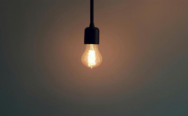
"Avoid the single ceiling bulb" — the cardinal sin
Source: Apartment Therapy, Living Etc, in-form-design.com
"A single harsh bulb in the middle of the ceiling is the fastest way to shrink a room visually — shadows pool in the corners, the space feels cramped, faces flatten. The fix: distribute light to multiple sources at multiple heights."
Why it works: names the default-HDB-developer install as the bad pattern, then sells the fix. Persuasive because every Singapore HDB owner has lived with one ceiling fluoro and felt this exact problem.
★★★★★
Lutron — bright top-down day
Spotlight + accent: the 30°-from-vertical art rule
Source: Edward Martin, USA on Canvas, miguelcamarena.com
"Aim accent spots at 30° from vertical onto art — steep enough to avoid glare on glass, shallow enough to avoid scalloping the frame. Use 24° to 36° beam for a standard frame."
Why it works: one number (30°) replaces a debate. Pairs cleanly with adjustable spotlight products on bshsg.com — sells the gimballed downlight specifically.
★★★★
10. Wattage, lumens-per-watt & the monthly bill
The translation that converts the lighting purchase into a financial decision. SP tariff in Singapore (Q2 2026: ~S$0.2727/kWh) makes the maths sharp.
What the homeowner actually wants to know: "Is this LED really going to save me money or is that just marketing?"
Alcon — lumen-to-watt ladder
"60 W incandescent = 9 W LED for the same brightness"
Source: VOLT Lighting, LEDVANCE, Eartheasy comparison
"A 60 W incandescent bulb produces 800 lm of visible light. A 9 W LED bulb does the same. That's 85% less energy for the same light."
Why it works: the buyer has 60 W as a mental anchor (the old bulb). One ratio (≈ 7×) covers every conversion. On bshsg.com, every fixture spec should show "X W LED = Y W incandescent equivalent" as a courtesy.
★★★★★
Alcon — lumen calculation chart
Singapore S$ savings math (per bulb, per year)
Source: Litoelectrical Singapore, SP Group tariff
"At S$0.27/kWh, swapping one 60 W incandescent (S$0.079/day) for a 9 W LED (S$0.013/day) saves ~S$24/year. A typical HDB with 25 bulbs: ~S$600/year saved."
Why it works: SGD per year is the only currency that matters. The buyer doesn't care about kWh — they care about their next SP Group bill. Localised numbers, not American calculator output.
★★★★★
Alcon — wattage comparison
"Lumens per watt (lm/W) — the efficiency number to look for"
Source: LEDVANCE, Department of Energy SSL
"Old incandescent ≈ 12 lm/W. Halogen ≈ 18 lm/W. Cheap LED ≈ 80 lm/W. Good LED ≈ 130 lm/W. Premium efficacy LED ≈ 200+ lm/W. Bigger number = brighter for the same energy."
Why it works: turns efficiency into a single spec the buyer can compare across products. On bshsg.com, every fixture should display its lm/W prominently — high-efficacy CGD products will win on this metric.
★★★★
Feit Electric — used as a payback-time hint
Payback time — "this fixture pays for itself in N months"
Source: Inch Calculator, US Department of Energy, Omni Calculator LED savings
"Premium LED downlight: S$45. Saves S$3/month vs halogen at 5 hrs/day. Payback: 15 months. After that, every month is free light."
Why it works: the upfront sticker price feels less painful when paired with a payback period. Bshsg.com could compute this dynamically for every fixture against the local tariff.
★★★★★
Feit Electric — daylight tone (long-life visual)
Lifespan in years (not hours) — "23 years at 3 hrs/day"
Source: Energy Star labelling, IKEA buying guide
"25 000 hour LED ÷ 3 hours/day ÷ 365 days = 22.8 years. You will repaint your HDB before this bulb fails."
Why it works: 25 000 hours is meaningless; 23 years is a lifetime decision. The buyer realises this is the last bulb they'll ever buy for that socket.
★★★★★
Feit Electric — energy efficient tone
"Watts × hours × tariff" — the household calculator
Source: Energy Use Calculator, SuperBrightLEDs
"Watts × hours-per-day × days-per-year ÷ 1000 = kWh/year. Multiply by tariff to get the annual cost. Halve everything by going LED."
Why it works: empowers the homeowner to do their own math for any room. The bshsg.com cart could auto-total expected annual running cost across all selected fixtures.
★★★★
11. Maintenance Factor & lumen depreciation
Engineering's hidden secret: every lighting design intentionally over-installs brightness, because LEDs fade over their life. This is rarely surfaced to homeowners but should be — it explains why fixtures don't all look the same after five years.
What the homeowner actually wants to know: "Why does my old downlight feel dimmer now than when it was new?"
Feit Electric — neutral white reference
"L70 at 50 000 hours" — the simple promise
Source: Cree, LEDVANCE, US DOE SSL programme
"L70 / 50 000 means: after 50 000 hours, the fixture still emits 70% of its original brightness. Good fixtures publish this. Cheap ones don't."
Why it works: a clean spec the buyer can check on the box. Differentiates premium fixtures from anonymous Lazada listings. Each bshsg.com product should show L-value + hours.
"Designers install at 1.25–1.4× the target lux, because dust, ageing LEDs and dirty diffusers each cut output over years. The maintenance factor (MF, 0.7 to 0.95) bakes the fade into the calculation."
Why it works: explains why the room feels "too bright" when first installed — and reassures the buyer that it's deliberate, not over-engineering. Protects against the "switch off two downlights" reaction in the first week.
★★★★
Feit Electric — cool white
The four kinds of fade (LLMF, LSF, LMF, RSDF)
Source: SS 531 maintenance factor breakdown, CIE 97, PNNL report
"LLMF: the lamp itself dims. LSF: some lamps die outright. LMF: dust on the diffuser. RSDF: walls and ceilings get dingier and reflect less. Multiplied, you lose 20–40% of light over 25 000 hours."
Why it works: the homeowner sees that "the room feels darker" is not their imagination. Practical message: dust your downlights and repaint walls every 5–7 years to maintain brightness.
★★★
Feit Electric — daylight tone
"Why premium fixtures still look new in 5 years"
Source: Cree TM-21 testing, ENERGY STAR LM-80
"A premium fixture is rated L90 at 36 000 hours — only 10% dimmer after a decade of use. A cheap LM-80-untested fixture often hits L70 in 2 years."
Why it works: justifies the price premium with a tangible long-term benefit. The buyer realises the cheap fixture isn't actually cheap when you replace it twice.
"Our eyes adapt — they don't notice gradual dimming. You only realise your old downlights faded when you install a new one next to them. Then the contrast jumps out."
Why it works: validates the homeowner's vague sense that "something's off" without making them feel they over-spend. Reframes upgrading older fixtures as restoring, not improving.
★★★★
12. Bonus translations
Concepts that appear at the edges of the buying decision but matter for premium fixtures, smart bulbs, and health-conscious homeowners.
12.1 Flicker — "the headache you can't see"
Feit Electric — used here as a reference
"Record the bulb on your phone's slow-mo"
Source: NPR Short Wave, TheraSpecs, Flicker Sense
"Open your phone camera, switch to slow-mo, point it at the bulb. If you see bands or strobing, the bulb is flickering. Even if your eye can't see it, your brain feels it after an hour."
Why it works: empowers the buyer to test any fixture themselves in 5 seconds. Brilliant DIY proof that "flicker-free LED driver" is real, not marketing. BSH could feature a "flicker test" demo on bshsg.com.
★★★★★
12.2 Circadian / blue light — "your bedroom should not feel like noon"
Feit Electric — warm bedtime tone
Melanopic lux — "the lux your brain cares about for sleep"
"Cool-white LEDs (4000 K+) at evening illuminance can deliver 800 melanopic lux to your eyes — enough to suppress melatonin and delay sleep. Warm (2700 K) at the same lux delivers only ~150 melanopic lux. Same brightness, 5× less sleep disruption."
Why it works: a health benefit attached to a CCT choice. Justifies "warm bulb in the bedroom" not as a vibe but as a sleep prescription. Singapore work-from-home + late evenings makes this especially relevant.
★★★★★
12.3 Bulb shapes (A19 / BR30 / PAR / GU10 / MR16)
Feit Electric — bulb shape contextual photo
"Letters = shape, numbers = eighths of an inch"
Source: GE Lighting Inform guide, Super Bright LEDs, bulbs.com
"A19 = A-shape, 19 eighths-of-an-inch wide (~2.4 in / 60 mm). BR30 = bulged reflector, 30 eighths wide. PAR20 = parabolic aluminised reflector, 20 eighths wide. Once you know the rule, the codes decode themselves."
Why it works: the buyer learns one rule and can read every bulb code in the store. Better than a chart because it generalises. Each bshsg.com fixture product should show the bulb shape with both code and the size in millimetres.
★★★★
12.4 Scenes — buttons for moods
Lutron — evening scene preset
"One button = one preset" (Lutron / Casambi / Hue)
Source: Lutron, Casambi, Philips Hue, Crestron
"Movie. Dinner. Wake. Sleep. Read. Five labels on the wall plate. Each fires a recipe across all the dimmers and CCT in the room. The homeowner never sees a number."
Why it works: the ultimate consumer abstraction — the lighting system disappears behind verbs ("Read"). Buyers don't shop for circuits, they shop for moods. Sell the moods.
★★★★★
12.5 Kruithof curve — the "why warm light only feels right when dim" rule
Wikipedia — used as a Kruithof analogue
The 1941 curve everyone follows without knowing
Source: Wikipedia Kruithof curve, All Things Lighting Association
"At 75 lx (cosy lamp light), 2400–2700 K feels right. At 500 lx (kitchen worktop), 2700 K feels sickly — you want 4000 K. The eye prefers warm-dim and cool-bright; the other two corners feel wrong."
Why it works: retroactively explains the room-by-room cheat sheet. Names the rule so designers and homeowners can talk about it. Note: later studies have qualified Kruithof's findings (the effect is real but smaller than originally claimed) — but the directional rule still holds and is intuitive.
★★★★
Top 10 reusable translation patterns for bshsg.com
If we abstract across the catalogue above, ten patterns repeat — these are the building blocks for every bshsg.com product page.
Pattern 1
The everyday-ladder anchor (moonlight → noon sun)
Anchor an unfamiliar unit between two values everyone already knows — bracket the technical numbers with the most extreme everyday equivalents, then drop in the home-relevant values in the middle. Works for: lux, CCT, lm/W, lifespan in years.
bshsg.com mock-up: every product card carries a horizontal lux ladder bar with the fixture's lux output marked as a flag — "this fixture: 400 lx at 2.4 m → between kitchen worktop and bathroom vanity".
Pattern 2
The same-room photo triptych
Show one room three or four times, one variable changed each time (CCT / layered scene / time of day). The buyer fills in the mental gaps. Replaces 500 words of explanation with three photos.
bshsg.com mock-up: on every smart-bulb / tunable-white product, embed a "Try the scenes" slider where the same HDB living-room photo morphs through Relax / Read / Concentrate / Energize.
Pattern 3
The water-faucet (or kitchen-tap) analogy
Map an unfamiliar physical quantity onto plumbing. Lumens are the flow rate. Lux is the wetness on a tile. Candela is the volume in a specific direction. Works because every Singapore household has a kitchen sink.
bshsg.com mock-up: a "Why these numbers?" pop-up on product cards uses a 6-second animated faucet-vs-drops-vs-square-tile to explain lumens vs lux vs candela.
Pattern 4
The mood-name façade (Relax / Read / Concentrate / Energize)
Hide the unit entirely. The buyer chooses a mood word; the system picks the temperature, lumens, dimmer levels. Pioneered by Philips Hue, copied by Lutron, Casambi, every smart-home system. The highest-conversion translation pattern.
bshsg.com mock-up: the bshsg "configurator" shows mood buttons instead of CCT sliders. Pick "Cosy dinner" → the catalogue filters to warm-dim 2700 K dimmable fixtures.
Pattern 5
The pool-on-the-floor (beam angle → diameter)
Convert a degree number to a tangible floor-pool diameter at the buyer's actual ceiling height. Replace "38° beam" with "1.6 m pool at 2.4 m HDB ceiling". BSH already does this — extend it.
bshsg.com mock-up: a configurator: pick ceiling height (HDB 2.4 / Condo 2.7 / Landed 3.0 m). Every downlight product card updates to show its actual floor-pool diameter and lux at task height.
Pattern 6
The weather-radar heatmap (replace isolux contours)
Drop the engineering contour lines and keep the rainbow gradient. Add room-furniture overlay. A 30-second floor-plan heatmap is the most powerful single graphic for "will my room be bright enough?".
bshsg.com mock-up: a "Room Light Forecast" tool: paste an HDB floor plan, drop in chosen fixtures, get back a weather-radar heatmap with green/yellow/red zones for each task area.
Pattern 7
The 3:1 (or 3×) ratio rule
Translate continuous values into "feature is 3× ambient" or "accent is 3× brighter than fill". Single-number rules replace dial-twiddling. Used for accent lighting, contrast, uniformity targets.
bshsg.com mock-up: next to every accent spot product: "Pair with 4 downlights of [X] for the recommended 3:1 art-to-ambient ratio."
Pattern 8
The room-by-room recipe card
One page, one table: room name → CCT, lux, beam, CRI, layer count. Replace explanation with a recipe. This is the page bshsg.com customers will print and bring to their renovator.
bshsg.com mock-up: a downloadable PDF "Singapore HDB lighting cheat sheet" — Living 3000 K / 150 lx / 4–6 downlights / 1 cove / 1 lamp + dimmer; etc.
Pattern 9
The financial framing (SGD/year + payback months)
Convert wattage into Singapore-dollar annual cost using SP tariff. Pair with payback months for premium fixtures. Money is the universal language of upgrade decisions.
bshsg.com mock-up: each cart line shows expected annual running cost (S$ / year) at standard 5 hr/day usage. Cart total includes "estimated bill impact".
Pattern 10
The 5-second test (camera slow-mo, mirror selfie, fruit bowl photo)
Empower the buyer to test a claim themselves with a phone in five seconds. Flicker = slow-mo. CRI = bathroom selfie under the new bulb vs daylight. Glare = photograph the bulb from the sofa and see if it's blinding in the frame.
bshsg.com mock-up: a "Test it yourself" panel on premium products: three short 10-second video instructions showing how to verify flicker-free, high-CRI, and low-glare with only a phone.
Bibliography
All sources consulted during the research pass. URLs valid as of May 2026.
Prepared by Claude (BSH research session, 16 May 2026). Image URLs verified at time of writing; the deliverable is portable but image hosts may rotate URLs over time. For production use on bshsg.com, replace third-party hotlinked images with BSH-licensed or self-hosted equivalents.
 Reolink — featured diagram, lux vs lumens explainer